Economists may not agree on much, but we all agree that economic output is a function of capital and labor. Ask a Keynesian, a Marxist, an Austrian, a monetarist, or any economist, and they’ll all agree that living standards are determined by the quality and quantity of these two factors of production.
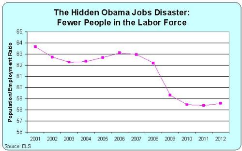
So it should be very worrisome that there has been a big drop in the share of the population that is employed. Here’s a chart produced from Bureau of Labor Statistics data, showing labor force participation during the 21st Century.
There was a big drop during the recession. That’s the usual pattern, and it definitely isn’t something that can be blamed on President Obama since the downturn began before he took office.
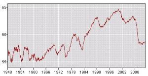
 But what is unusual is that the employment/population ratio has not bounced back. As you can see from this second chart, taken directly from the BLS website, there’s normally a “V” pattern. The numbers drop during a recession but then quickly bounce back.
That hasn’t happened during this “recovery,” and that’s something that can be blamed on the President’s policies. Millions of jobs have vanished. But most of these lost jobs don’t even show up in the official unemployment rate data because workers have left the labor force.
Why have so many jobs – and so many workers – disappeared?

No comments:
Post a Comment