For nearly a week, a leaked draft of next year’s “Fifth Assessment Report” on climate change, by the United Nations’ Intergovernmental Panel on Climate Change (IPCC), has been burning up the blogosphere. Since it’s everywhere, I’ll take my liberties and join the party.
The most impressive figure shows how badly one of their most-cited series of predictions is faring. Explanation follows.
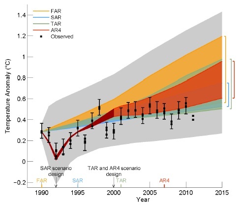
The colored shading shows the projected range of global annual average surface temperature change from 1990 to 2015 for models used in the succession of IPCC assessment reports, labeled “FAR” (First Assessment Report, 1990), SAR (1995), TAR (2001) and AR4 (Fourth, 2007). The “emissions scenarios” generally cover the range from each report during the period from 1990 to 2015, and the changes in atmospheric greenhouse gas concentration that have been observed pretty much fall within this range. The very large grey zone is irrelevant to the forecasts that were made.
The three small black rectangles each year are the observed global temperature histories in common use. For every year except the last one (2011), the black “whiskers” are an estimate of the 90% confidence range for the observed temperature. Since the three records pretty much use the same data, I wouldn’t have a lot of faith in the reality of those whiskers. Data were not fully available for 2011, so any whiskers would not be comparable to the others. Quite obviously, for more than a decade, the observations have fallen near or below the lower end of the IPCC projected range. Houston, we have a problem.
No comments:
Post a Comment